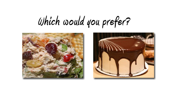
Its early February. You are looking to impress that new special person in your life. You get home from work and jump on the net to find the perfect restaurant for the perfect Valentines dinner. Two restaurant websites pop-up in your browser…
For a moment pretend you can’t understand a word on either of those websites, nor are there any prices shown. All you can see are the photos displayed on each site (Below is a sample of each site’s photos).
Now after seeing the pictures, which restaurant might you pick?

Building a great website is similar to following a great recipe. A recipe that absolutely requires a few key ingredients to truly be a success. For this post, I focus on just one ingredient in that recipe; a 1/2 cup of photography.
Its actually quite simple; bad photos can easily kill what would otherwise be a great website. So why do so many websites use terrible photos?
Some of the more common reasons:
- The business owner has a son who likes to take pictures.
- Or the owner fancies themselves working as a staff photographer for National Geographic (using a disposable camera they just bought at CVS, with photos they just had developed in an hour or less).
- Or the one we see the most; The company just bought a $2500 digital camera.
Unfortunately, just the same as buying a $2,000 guitar is not going to make you the next Eddie Van Halen, a great camera alone is not going to give you incredible shots. Photography is an art and a skill combined. Great shots don’t just happen.
Our advice? Don’t skimp on the photos; don’t take photography lightly. If paying a professional photographer for a full day shoot is just too much of an investment for you to make, what about enlisting the help of a college student who is studying photography? Or at the very least asking your web design firm if they offer photographic services? Chances are your designer either has someone on staff, or they partner with a semi-professional or professional photographer who offers discounted prices.
Photos can make or break your website…

